The branding and identity for Slow Things was designed to reflect the nature of my creative practice – a transdisciplinary melting pot of different technologies and media through which interactivity is explored.
Ideas can be 'messy', tangled up with evolving perspectives, foci and interpretations. A blurry 'squiggle' evolving into a typographic, wordmark responded to this narrative.
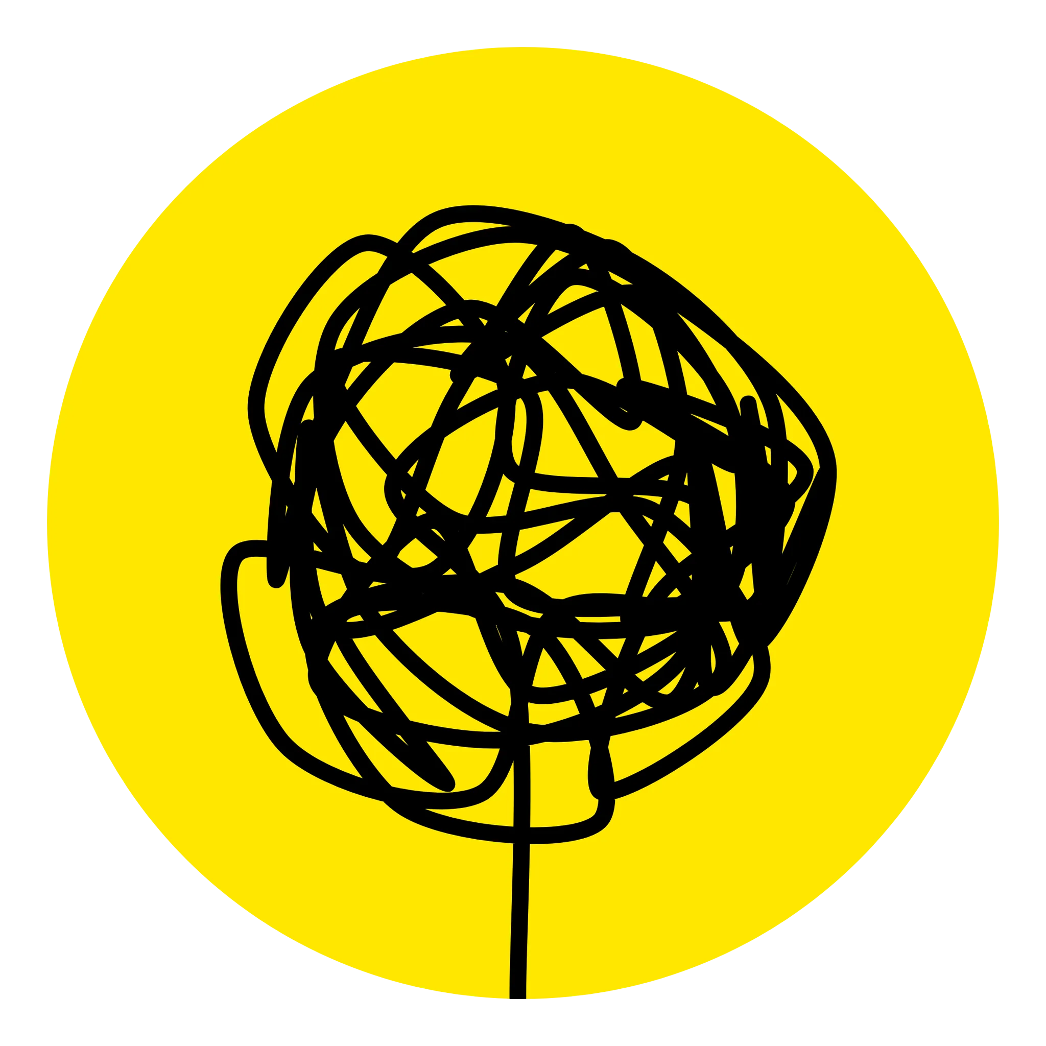
Drawing on the hand-drawn sketch as a creative practitioner’s first visualisation of an idea, I wanted to connect to another nuance: the responsive, dynamic nature of modern-day digital design. The ‘squiggle’ is intentionally ‘alive’, not only as a static or motion graphic, but a dynamic one. By dragging the squiggle, one could shape it, scrunch it, or turn it into an extended curve. This becomes a nod to the Slow Things philosophy: reflection, contemplation, and time spent to do these things.
The remaining elements of the design provided further scaffolding: the use of a bright, cheerful yellow accent for an optimistic outlook; a tidy layout grid across all brand media (and a responsive layout for web content); and subtle, soft transition effects towards a ‘slow’ aesthetic.
This is a Creative Practice assisted by AI
Like many other professions, designers and developers today are confronted with AI taking over their jobs, and while we have to stay engaged with the cutting edge, we are concerned with losing credibility for incorporating AI in our work.
Slow Things engages with technology, to critique and work with technology, and AI is no exception. It’s about balance and rigour on maintaining creative integrity whilst still benefiting from AI-assisted production.
For example, a ‘squiggle generator’ program was written with the help of AI to parametrically explore the different variants, weights and styles of stroke lines. The creative decisions and know-how to work and fine-tune the generator’s features is still a decidedly human and personal decision. This manner of co-working with AI underscores this new working relationship humans are now encountering across all disciplines. Having a logo that is ‘generated’ parametrically with the assistance of AI reflects the Slow Things approach: festina lente (make haste, slowly).
Be like water, my friend.
Designing a responsive web layout is different to traditional publishing–different devices, aspect ratios, all make for a challenging, fluid canvas that must take into consideration legibility, good design principles and flexibility. These still need a designer’s eye today to get right, especially for ‘handcrafted’ layouts.
The digital logo’s malleability conceptually connects to the brave new world of digital design & development: now that we don’t need (or can’t, given the increasing AI integration in dev tools?) to write code or markup from scratch anymore, there is now a lot more time we can spend to refine, iterate and develop the conceptual and aesthetic details. This isn’t completely new: creative industries have had to re-adapt constantly with every paradigm shift in technology. This remains a fine balance that creative technologists will continue to thrive in, and the dynamism and fluidity of the Slow Things brand speaks to that aspiration.